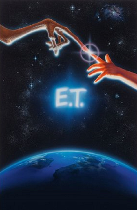
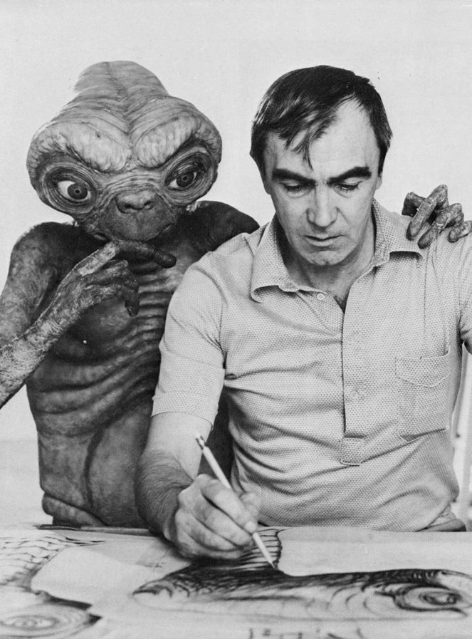
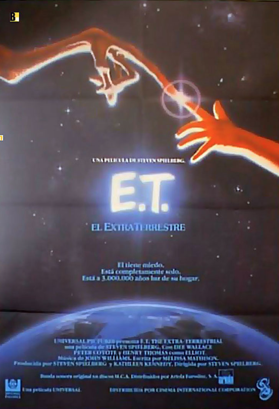
If I said I had a favorite movie poster and then touched my two index fingers, you’d know which poster I meant. The mark of a great movie poster is one that, when the movie is mentioned, it’s the poster image it conjures, not a scene from the movie. E.T. the Extra-Terrestrial is the ultimate example of that, and my friend, movie campaign artist extraordinaire John Alvin, is responsible for that glorious image. Saturday, June 11th marks the 40th anniversary of the release of E.T., so now is the perfect time to celebrate and go deeper into the making of John Alvin E.T key art., which represents one of the most iconic movie posters of all time.
John Alvin created hundreds of movie posters, many of them instantly recognizable. They include lots of classics from the 70s, 80s, and 90s, including Blazing Saddles, Young Frankenstein, Blade Runner, Gremlins, Willow, Dark Man, The Goonies, Cocoon, The Lion King, Aladdin, Beauty and the Beast, Arachnophobia, and so many more. His career was cut short when he passed away in 2008 unexpectedly. Though there was much of the creative spark left in him, he still left a wonderful body of work behind, and had a long, storied career.
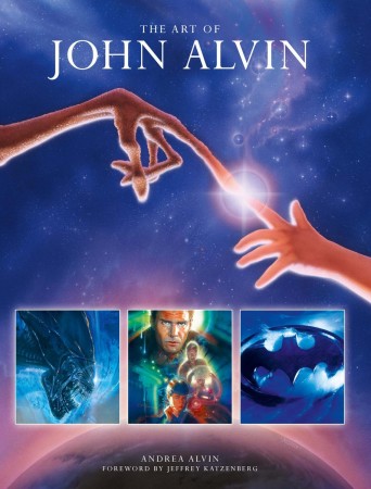
He got into the film business shortly after graduating from the famed Art Center in Pasadena. He had created some images for plays with advertising professional Anthony Goldschmidt. Anthony was working on the advertising campaign for Mel Brooks, and his movie Blazing Saddles. As Andrea Alvin, John’s wife and partner in Alvin and Associates, and author of the book The Art of John Alvin explains, “He and Anthony had worked together on posters for some plays, and Anthony came to John and said, ‘Mel Brooks is doing a movie, and I’m doing the titles for it. He hates everything that Warner Brothers is doing. Would you want to do a painting on spec where we’ll be partners and send it in and see if Mel Brooks likes it?’ They did that and Brooks loved it. That’s how John got started in movies.”
Andrea says that from the day Blazing Saddles was released, John never had another slow day as an artist. Word had gotten around about his work, and Brooks had become a fan. John worked as freelancer with Goldschmidt, who used him as his go-to artist through Intralink Film Graphic Design, which Goldschmidt started in 1979. “He can do anything”, he said, according to Intralink’s senior art director Judith Kahn. “He became Intralink’s de factor resource for executing the appropriate imagery wherever an illustration was needed. Whether the drill was functional, for example a deft hand needed for rendering a quick pencil sketch to convey the idea to a client, often for trailer graphics or a main title sequence, contexts for which John is little known, or fully collaborative, the ace artiste called upon to execute a key art image whose concept we’d pitched and secured approval on, John’s versatility proved second-to-none.”
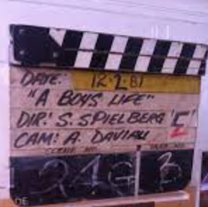
Never is that more in evidence than the art John created for Steven Spielberg’s E.T. He started working very early on, way before it was shot, when it was called “A Boy’s Life”. Andrea recalls several title permutations. First it was called A Boy’s Life, then E.T. and Me, and then finally E.T. the Extra-Terrestrial.
One of the cues in the wonderful score by John Williams is called E.T and Me:
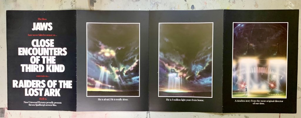
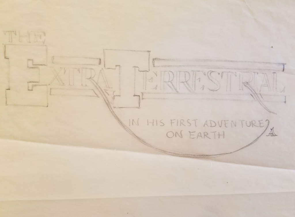
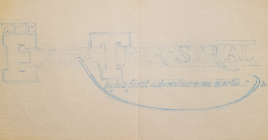
He was asked to do a lot of preliminary stuff, like the designs and images for the trades to promote and get buzz going inside the industry for Spielberg’s new film. One item was a big foldout trade ad. Andrea still has one of them in her collection, and she is allowing me to show it here:
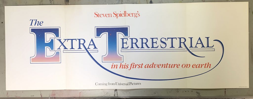
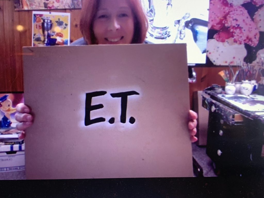
John did a lot of work designing and tailoring a logo for the titles. Andrea explains the way he created the writing for the back of the trade brochure. “What they used at the beginning, which was done before the film was shot, they were doing a lot of logo exploration. John did a lot of hand-lettering, although this was designed from a typeface. Nothing exists exactly like this. He did the mask, and painted the sky inside the letters and the big swash on the R that goes to the end. That’s all hand done. For the brochure, it’s basically an artistic modification, whereas the lettering on the finished poster was created by John, and unique to him.” As she reminded me, there were no computer programs for graphics back in 1982, so the type was set, and any modifications were done by hand.
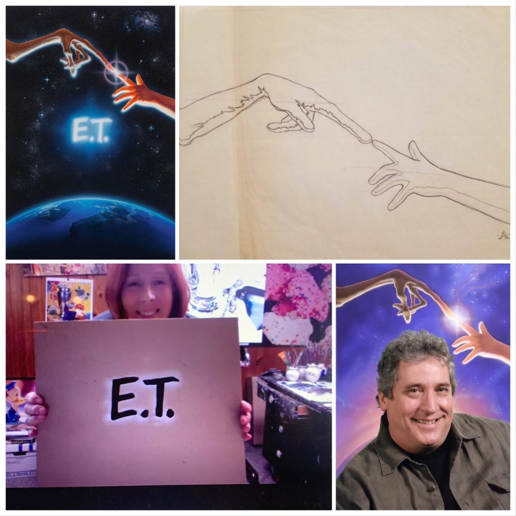
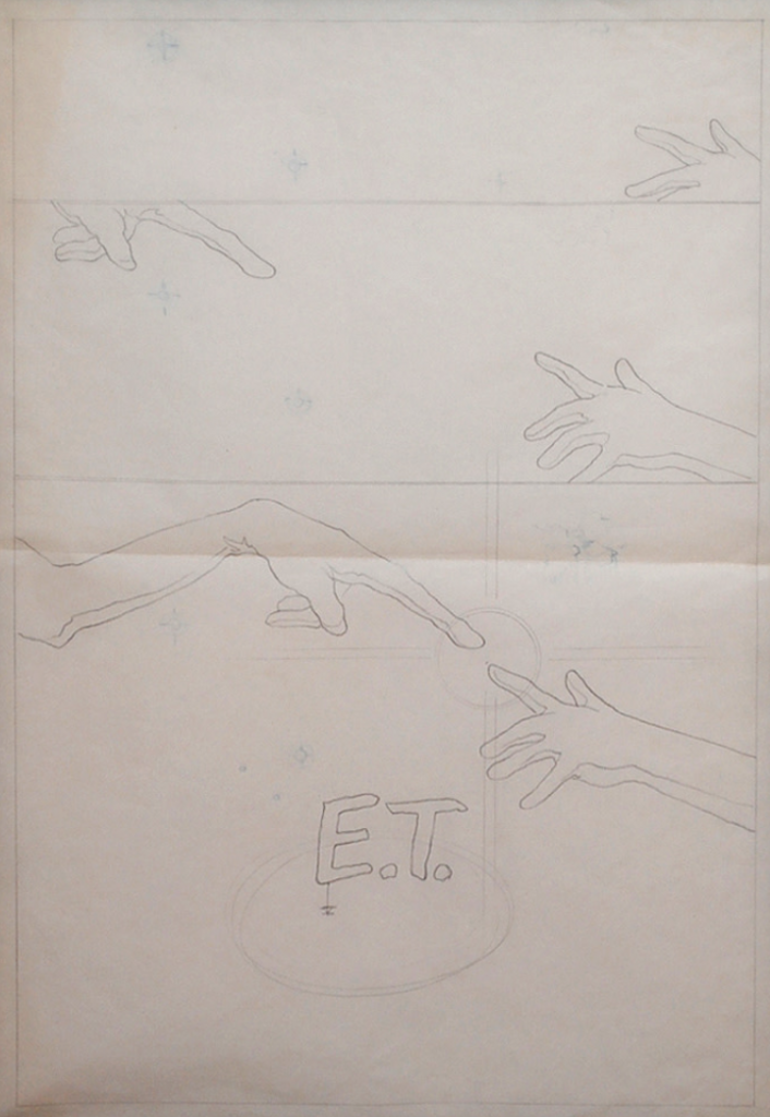
The idea of The Creation of Adam as a basis for the image was decided early on for the key art. That being said, what would the hand look like? The poster itself did not have to go through that many permutations before Spielberg and his team were happy with it, but John initially found it a challenge because he had not seen what the alien looked like and had no basis for design. Not wanting to reveal E.T’s true form, the filmmakers offered John a rubber hand to work from. It was, as I remember from John laughingly talking to me about it, “impossible”.
What they gave him was this flaccid, flat, dead or fake-looking greenish piece of rubber, and there was no way he could get the magic of this charming, soon-to-be beloved alien right with a piece of rubber. Ultimately they persuaded the E.T. team to get John a blueprint of Elliott’s hand, drawn by creator Carlo Rambaldi, and John used that as reference in creating the poster. I asked Andrea if she still had the drawing. “I wish! They took it back as soon as John was finished with it.”
With Rambaldi’s blueprint for E.T.’s hand, John was able to create that mysterious drama we all know and love. Remember, at the time, it was the only clue about what the alien would look like! As is always the case in the process of making a finished painting to use as key art, John created a number of images for approval before being able to proceed. At this point, he had really leaned into his signature style, using what is now known as “heavy light”, but what would the composition of the image be? Whose hand could he use as a model for Elliott? They had sent some photographs of kids’ hands, but nothing seemed quite right, so John took his pictures of his own daughter Farah’s hand in all the positions that might work for his image. It’s Farah’s hand in all the below graphite concept art, and, ultimately, the famous finished poster.
In addition to needing an accurate model for the alien and Elliott, John needed to get the titles exactly right. He wound up creating it himself. Here’s what he used to make E and T on the poster, which Andrea still has in her collection:
Says Andrea, “The reason he made this was so he could spray through it, and have it kind of blurry on the edges, so it was soft. If he had cut a mask for it, it would have been very hard-edged. In keeping with the poster that all that this “heavy light” he made this mask, which is on the back of a 14 x 16 tracing pad, and he cut it out and sprayed through it. You can see the paint that’s still on it from when he did it. They wanted, on the finished poster, something that looked a little more hand-made, so it’s not like a typeset logo.” She goes on to explain why John chose to create this particular kind of design, which has become iconic and recognized all over the world, for the letters. “They wanted something that had a more casual feel about it. The movie is about kids, really, and this is more of a hand-lettered look. By the time the movie was getting ready to release, they knew it was about kids and more visceral.”
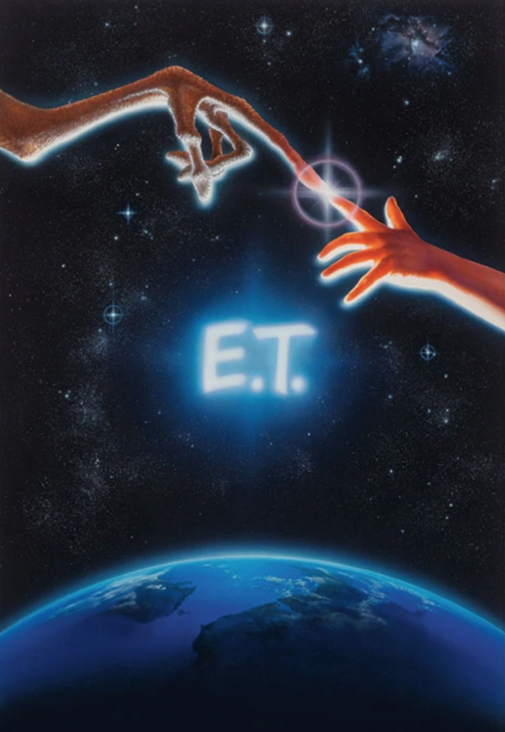
The key art was painted in a very large format, and the process was, well, what would now be called old fashioned. Andrea relates, “It was a big piece of art. It was like 30 x 40, okay, or 40 x 60, because they had to do it large, so that when they took a transparency of it, it had all the details. Now you can take a picture of a small thing at a high resolution, but they couldn’t do that then, so they had to do a big, big painting. I was was in the room with him when he was doing it. I mean, we didn’t to wear masks. We’d end up blowing our nose blue for a couple of days from all this overspray!”
So. What was his process? John Alvin was famously vague about how he worked, although he mentored many younger illustrators coming up in the industry. He didn’t want to take the magic away from the finished product by dissecting the way his key art was made. Still, Andrea can answer that question. “In the case of the E.T. art, it followed the way John’s process would be generally. If there were a lot of details, like on the alien hand E.T, which has a lot of texture, he would do that with a paintbrush, in acrylic paint. He masked that off, and then he painted the sky with the airbrush. He came back in and did airbrush work over the top of the painting, and then he put in details on top of that with Prismacolor pencil.” That’s why it’s so common to see “mixed media” in the description of an illustration original!
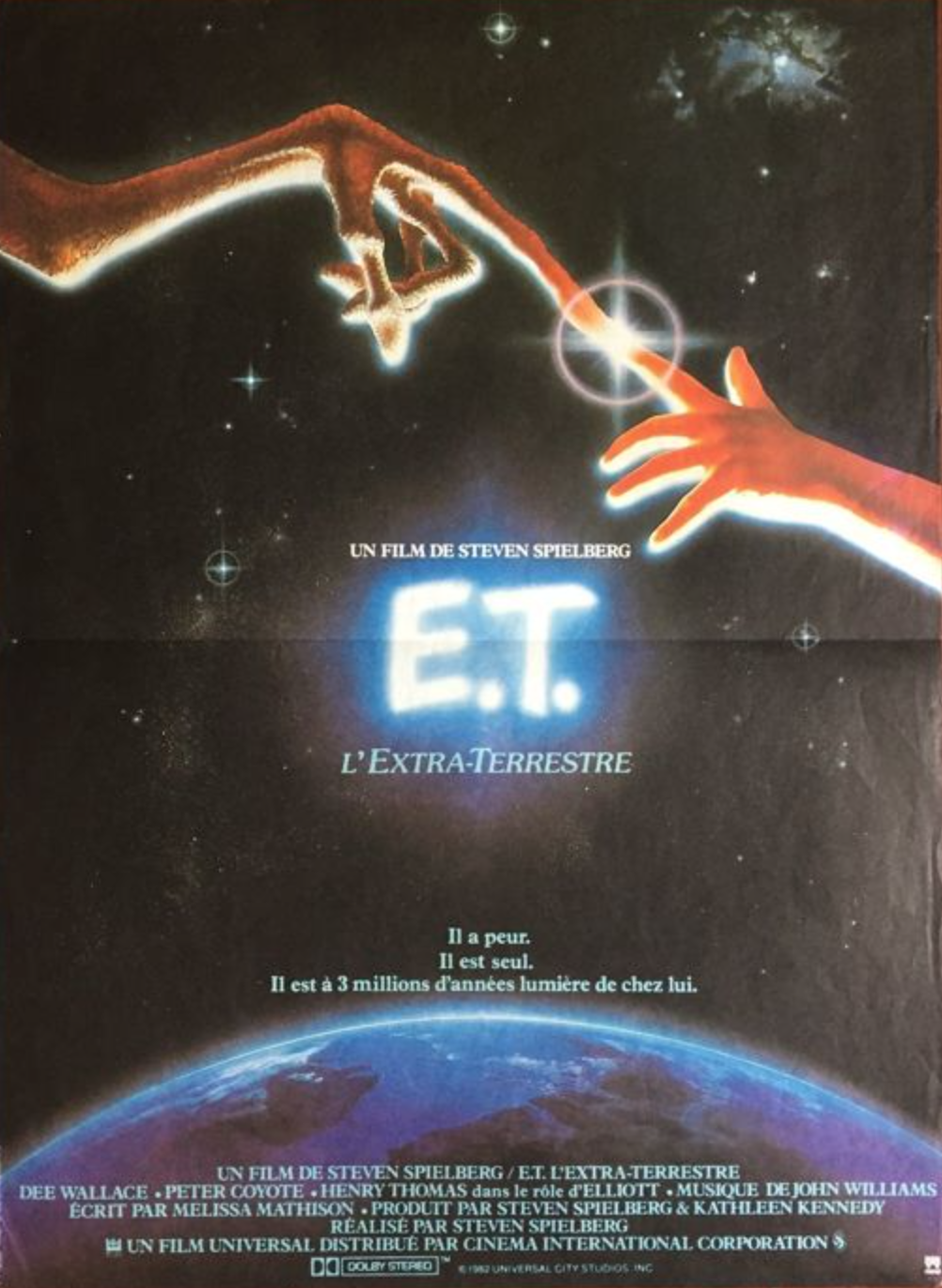
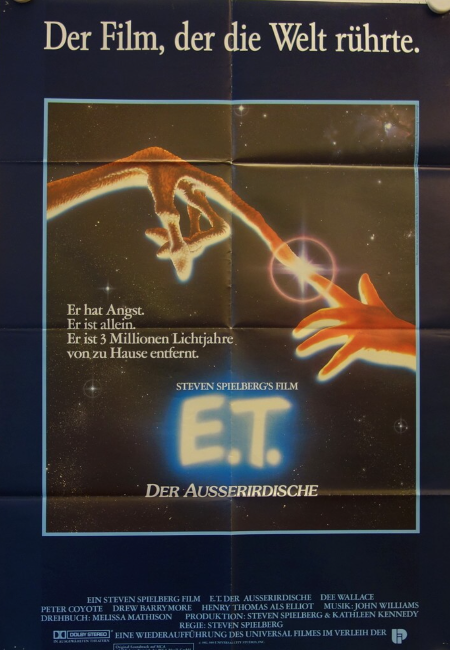
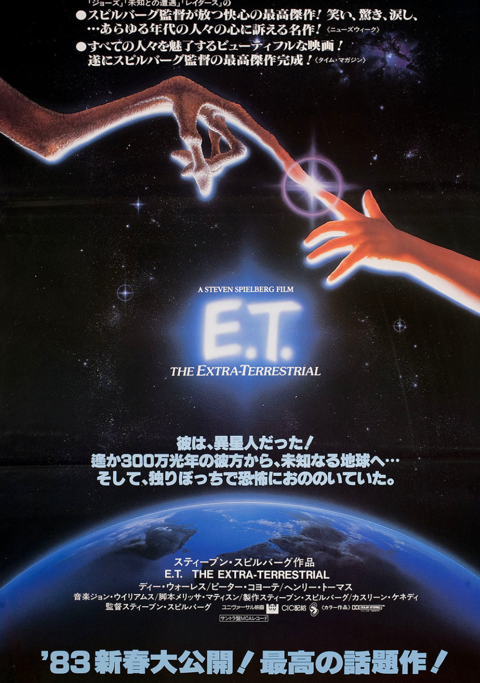
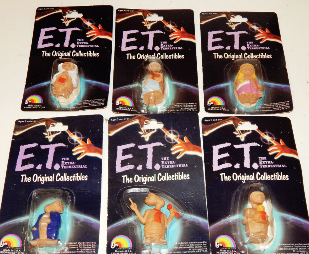
John Alvin’s poster, which won the Best Poster Art Saturn Award in 1982, was used for releases all around the world, and then for nearly all the merchandise.
Did John Alvin know it would be such a huge hit, shattering box office records that took years to break? According to Andrea, “Until the movie was released, we didn’t know that it was that big a hit. Then, as it became released, they took his finished art and put it on everything. I happened to go to the Los Angeles Gift Show that year, for whatever reason, and it was, I mean, from keychains, to bath towels, to sheets, it was on everything. So you can still find a lot of the merchandise with his image on it.”
One of the most remarkable stories connected to E.T. and the Alvins is that, by sheer coincidence, they wound up moving to the neighborhood where some of the film was shot in the Porter Ranch area of the Valley. They bought the house, moved in, and then discovered it was where the Halloween and chase scenes were filmed!
John always believed he was creating, as he called it, “the promise of a great experience”. In the case of 1982’s E.T., not only was it an enchanting feel-good film, it also had John Alvin’s magical touch, which, without even revealing the characters or plot lines, or, as is the case now, using a photograph that promoted one lead actor, had an enormous impact on turning movie lovers into E.T. audience members. It was Spielberg that made good on the promise of a great experience. The snowball effect that led to E.T. holding the record for the highest grossing movies for years started even before the first move trailer. It started with a poster. It started with John Alvin. On the 40th anniversary of the release of E.T., let’s thank John, wherever he is.
You can celebrate the 40th anniversary by seeing E.T. the Extra-Terrestrial in theaters in IMAX this August! It will play exclusively on IMAX starting August 12th.
For more fun and fascinating info on the making of E.T., check out this documentary:
If you’re in the mood for some serious fan service, as well as a healthy dose of advertising, there’s a 2019 E.T. sequel of sorts in the form of a 4 -minute holiday ad starring Henry Thomas called “A Holiday Reunion”: